-
Running Pittsburgh’s Top Craft Market Seamlessly: I Made It! Market’s Story with Formplus.
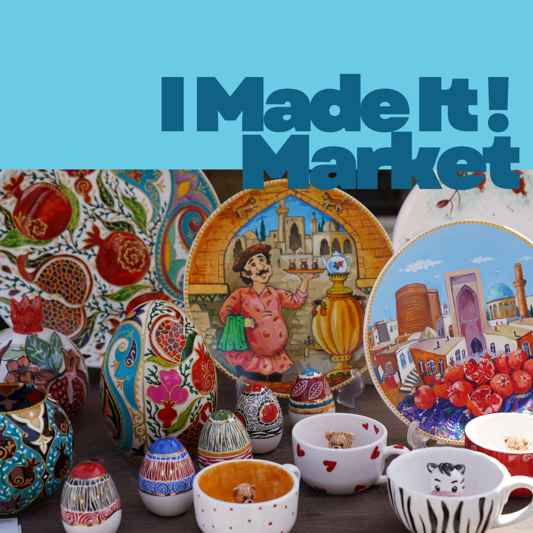
I Made It Market is more than just a craft marketplace; it’s a celebration of Pittsburgh’s thriving community of local artists, makers, and small-batch food vendors. Recognized as the Best Place to Buy Locally Made Crafts 2024 by the Pittsburgh City Paper Reader’s Poll, the market has become a trusted platform for artists to gain exposure, connect with…
-
How AASHE Streamlined Global Sustainability Program Submissions with Formplus

For more than two decades, the Association for the Advancement of Sustainability in Higher Education (AASHE) has helped campuses around the world turn climate initiatives into measurable, actionable progress. “We have over 900 colleges and universities that are members of AASHE; they’re the institutions we primarily serve.” As one of the largest global networks dedicated…
-
Research Papers vs. Research Reports: Why Knowing the Difference Matters
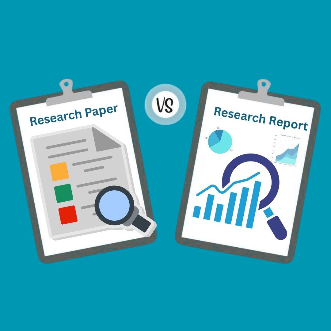
Is there really a difference between research papers and research reports? The truth is, people tend to use them interchangeably. In fact, there’s no universally agreed-upon difference between the terms. However, if you’re expected to turn in a report and you turn in a full research paper or vice versa, you’re probably not going to…
-
How to Write Research Questions That Get Approved

Your research question is what defines the gap you’re trying to fill. It’s what guides the direction of your research and the research methods you use. Typically, you only need a single research question to guide your study in essays and research papers, but for market research and surveys in general, you need questions. Without…
-
Thematic Apperception Test vs. Rorschach: What’s the Difference?

“It’s all about perspective.” No two brains work the exact same way; they can work similarly, but not the same. That’s why we see completely different things or focus on different things when we look at the same image or watch the same TikTok. But it’s not just about perspective, though; it’s also about personality. The…
-
Key Components of an Evidence Collection Form

Imagine something went missing at work, you put your thoughts together and have a few clues-however you have to guard your clues jealously so you can finally land at the truth. This is where an evidence collection form comes in handy. It is an important document used by law enforcement officials to document vital information…
-
Misleading graphs In Surveys: What it is, Examples, Causes & Impact

Imagine scrolling through the internet and you see data depicted with a graph stating that 90% percent of adults love this new product. While the number and data seem impressive something feels awkward and you wonder if this is the truth or if is it just cleverly presented. Data visualization is the the ace card…
-
Defining a Research Problem: How to Identify and Resolve Research Problems
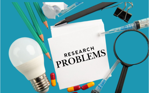
It’s instinctive to avoid problems, but with research, you have to look for problems and not just any problems, good problems. The goal of every research is to solve existing gaps in innovation or research, so your research must solve a problem for it to be a good one. However, people publish papers just to…
-
How to Choose the Best Academic Research Platforms in 2025 (No ChatGPT)

Getting free access to academic articles is one of the best things that can happen to you in your research journey. However, over 10,000 research papers had to be retracted in 2023 and experts claim about 90% of medical research journals are useless. The question isn’t “how to find academic databases” but “how do you…
-
How To Create A Diabetes Risk Assessment With Formplus

Can you imagine living your life while there is an unnoticeable threat in the background? For millions with diabetes, the path leading to this dreadful disease is often quiet and might showcase in any aspect of daily life, from low energy levels to a total breakdown in overall health. Knowing your risk for developing diabetes…